
You’ve heard it before.
Not once. Not twice. I probably can’t even count it on two hands.
It’s no secret that mobile is here to stay. It’s no secret that businesses need to begin thinking about mobile users.
But why?
Sure, we all know that a responsive site makes mobile browsing simpler. But what makes this a NEED? Why is mobile-optimization a must for YOUR business?
Check out these 10 reasons your website can’t afford to remain unresponsive.
1. Everyone’s on mobile.
We are no longer living in a world where smartphone users can be considered the exceptions.
We are not even living in a world where excessive smartphone users can be considered exceptions.
Today, 1.2 billion people are accessing the web from mobile devices. An incredible 80% of all internet users use a smartphone. In other words, if they’re online, they are most likely on their phones.
And today’s statistics are only half the story. These numbers will be even more skewed towards mobile in the future. Simply put, you NEED to be thinking mobile, because EVERYONE is on mobile.
2. Over half of web traffic is mobile.
I have yet to meet a website owner who wasn’t interested in increasing traffic.
As of May, 2014 (over a year ago), mobile media consumption was 21% higher than that of desktop, accounting for a 51% of ALL digital media consumption.
This means that over half of all web traffic is via mobile. If you are interested in attracting mobile traffic (aka traffic), you need to be thinking mobile.
The obvious question that comes up here is, “Why can’t mobile users just engage with my desktop site via their phones?”
The answer to that is…
3. Mobile users behave differently.
While it’s theoretically the same people behind both mobile and desktop traffic, these people tend to behave differently across devices.
Despite limited bandwidth, mobile users tend to consume a disproportionately high amount of visual media, with a major focus on short video and images. Social media sites like Vine and Instagram achieved massive success from offering solely video and images respectively.
Capturing this traffic requires an optimized design, harnessing the power of these media types to engage users.
For example, addthis mobile-optimized share bar, his social shares immediately DOUBLED.

Imagine doubling your traffic with a few tweaks. This took literally 5 minute of Bryan’s time.
Making these adjustments is crucial for your bottom line, because…
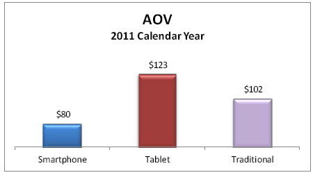
4. Mobile users buy more.
Across devices, mobile users actually spend more than their desktop counterparts.
Smartphone users account for the lowest dollar amount per transaction. These users are conditioned to make small, frequent purchases. If you are attempting to sell something below $10, mobile users are an ideal audience for your offer.
Tablet users, on the other hand, have the highest average transaction value of any device, including desktops.
’t handle every type of screen, you are missing out on sales.
- Mobile landing pages require different strategies.
Your landing page is your conversion workhorse. It HAS to get the job done if you are interested in generating online revenue.
But did you know that what works for desktop landing pages is NOT the same as what works for mobile landing pages? Certain principles remain constant, but mobile screens can’t handle the same style of presentation you would employ on a full desktop screen.
If your business is hoping to take advantage of the small, frequent purchasing behavior of mobile users, you’ll need to create responsive landing pages with mobile users in mind.
According to GetResponse, mobile landing pages should include the following:
- 5-word headlines
- Minimalist design
- Bright button CTA
- Lightning fast page-load speed
7. Google favors mobile responsiveness
For some time now, Google has favored mobile friendliness in its SERP rankings.
As of April, however, the stakes have been raised, and mobile responsiveness is more important than ever for pleasing Google and acquiring organic traffic.
With Google’s latest major algorithm update, the company enacted significant penalties for websites failing to meet its standards for mobile friendliness. While this change wasn’t quite the “mobile-geddon” SEO’s predicted, it did create some waves, with mobile friendly pages taking much less of a hit.
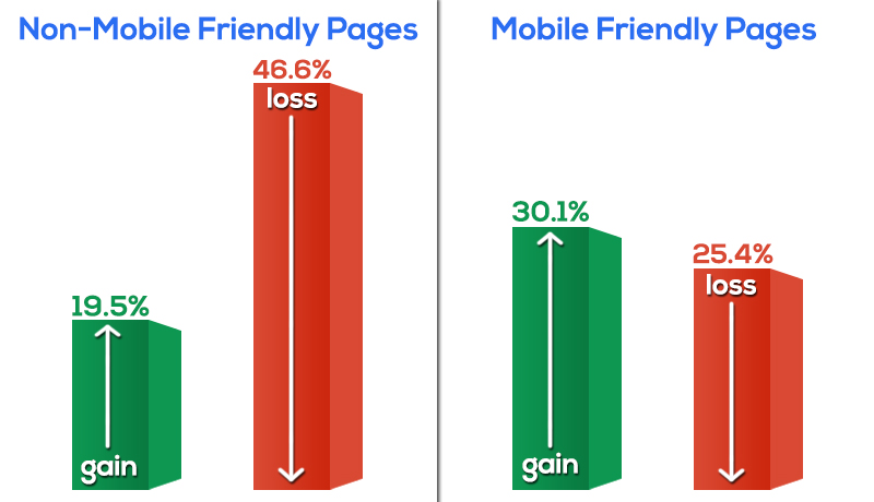
If you are serious about improving your organic traffic (or simply not losing it), you need to optimize your website for mobile.
8. Social media referrals are on mobile.
91% of mobile internet access is used for social activities. As social media continues to grow and evolve, it’s finding its primary hub on mobile devices.
If your business is involved social media marketing of any sort, there is a better than average chance incoming traffic will be accessing your site via mobile devices.
An unresponsive site can negate your content marketing efforts and waste your paid advertising dollars. If you want to take full advantage of your social audiences, you need a site designed to seamlessly catch their social browsing click-throughs.
9. Great mobile sites differentiate your brand.
By this point, if your brand has yet to optimize its website, you may be feeling like you need to play catchup.
While that’s true to some extent, the reality is that many sites remain unoptimized for mobile. According to a recent survey, only 56% of small business websites are responsive.
What does this mean for your business?
It means you have a fantastic opportunity to differentiate yourself from the competition. Statistically, nearly half you competitors could have unoptimized sites. Furthermore, a big chunk of those who have implemented responsive design are probably doing a pretty poor job of it.
Optimized your site for mobile is an easy way to immediately gain an edge.
10. Mobile advertising is still underutilized.
In the same way that mobile offers an incredible opportunity for brand differentiation, it also offers an unparalleled opportunity in advertising returns.
Americans currently spend 24% of their time on mobile devices, and yet only 8% of ad spending goes toward mobile advertising. According to Kleiner Perkins, this represents a $25 billion opportunity gap.
Underutilized = cost-efficient
Today is a prime time for investing in mobile advertising, but the channel won’t be underutilized for long. In the next 3 years, mobile ad spending is projected to hit $42 billion, quickly eliminating the opportunity gap and bringing up costs as the demand continues to increase.
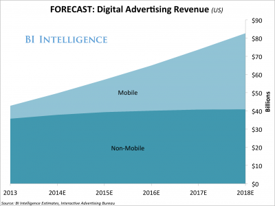
Now is the time to invest in mobile ad spending, and you need a responsive design to accomplish this.
Get Mobile
The first step to optimizing for mobile is implementing a responsive website design.
Hire CodeCarrot team for making your website responsive.
The second step is optimizing your marketing efforts for mobile within your responsive design. This involves analyzing how customers are engaging with your site and adjusting accordingly.
P.S. Can we send you an email?
Once a week or so we send an email with our best content. We never bug you; we just send you our latest piece of content. Subscribe Here.
Response to “10 reasons website needs mobile optimized”