
We’ve already gone over how to describe typefaces and how to choose a font, so now it’s time to learn about mixing fonts. Combining different typefaces is an indispensable part of providing readers with an elegant, pleasurable read.
Mixing fonts isn’t a matter of picking 2 contrasting typefaces at random and putting them on a page—it requires careful effort so the fonts complement one another in their different shapes, sizes, and textures, and bring a visual harmony to the page.
Why mix fonts?
Mixing fonts is usually useful for 2 main reasons:
- Provides typographic contrast without adding design noise to a page
- Provides an additional font when body text may not be suitable by itself for many different kinds of content
To provide typographic contrast
An additional font can bring emphasis to different kinds of content (headings and block quotes, for example). Bringing contrast to these can make the page feel more elegant, or it can make the content easier to read.
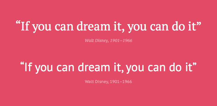
A great example: using serif text for a block quote. The serif text complements the surrounding text and provides a gravitas that the standard font would not.
Because the body font is unsuitable
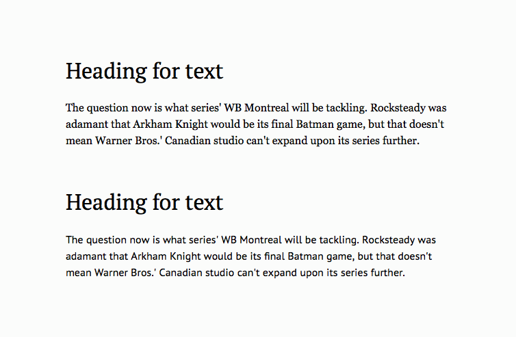
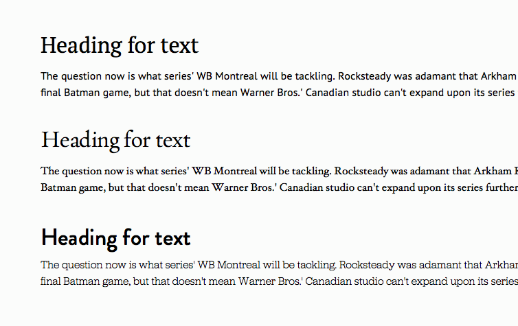
In cases where a superfamily isn’t suitable and the body text font doesn’t work at larger sizes, use a different font for larger text such as headings. Using a similar font to the body text is a dangerous game—each font will be subtly different, and while people may not be able to articulate why something looks wrong, they’ll feel it. So it’s best to provide some contrast between these 2 different kinds of fonts.
Experimentation
Mixing fonts is about experimentation and playing with ideas, but understand how the font is going to be used. Is it a heading font? Then create a layout where the text will need to be tested as a heading. Is it a blockquote font? Do the same.
Once the role of the new font is clear, start searching and mixing fonts. Use the same methods mentioned in the previous chapter to find the required font, and compare it alongside your font to see if it works.

Tips for finding the right font
A simple tip for deciding whether 2 fonts will compare well: Look at the x-height of the font and try and match that to the body text. The x-height is a major factor in defining how text feels when read, so if 2 fonts have a similar x-height, they’ll be easier to combine and will flow into one another more naturally.
“Mixing fonts is about experimentation and playing with ideas.”
Inspiration for mixing fonts
Need some recommendations and inspiration? Check out these sites:
- TypeGenius (http://www.typegenius.com)
- Just My Type (http://justmytype.co)
- Font Pair (http://fontpair.co)
2 fonts might not be enough!
In traditional print design, it’s common to mix more than 2 fonts to bring contrast, texture, and hierarchy to a page. Newspapers are filled with words—and these words are designed to help communicate the design.
So if a design is complex and requires more weights of a font, then it’s okay to introduce them.
This isn’t to say it’s okay to add a bunch of fonts to a design—this has further ramifications like page weight and additional complexity in typesetting. Use only what’s necessary and nothing more.
Don’t settle on the first fonts you find
It’s possible to strike gold on your first attempt, but it’s never a good idea to stop the moment you find a font that seems right. Continue to experiment with different fonts. Think of the different variations of where this font will appear and what screens it’ll be on.
Think of mixing fonts as any other part of an iterative design challenge. With each choice there’s an opportunity to improve.
Managing the roles of each font
Now that you’ve chosen fonts and they’re working well, start figuring out each font’s roles in the design. Something as simple as a text document outlining what each font will be used for will help bring consistency to a project—plus, it’ll be a good reference throughout.
A document like this is the beginning of a style guide, and starting early is an incredibly efficient way of moving through a design.
Here’s an example of what the document could look like:
Primary heading: [ Font Name y ]
Secondary heading: [ Font Name y]
Tertiary heading: [ Font Name x ]
Intro text: [ font name x ]
Body text: [ font name x ]
Pull quotes: [ font name z ]
Caption text: [ font name x ]
Most applications have useful paragraph or character style palettes that can be used to manage these styles as an easy reference, too. On a daily basis, I use Sketch, Photoshop, Keynote, or Pages—each of these applications has a sidebar where I can click a button to add, modify, or remove a text style. At the click of a button there’s a reference to my font styles and a way to update every text style in a document.
Response to “How to Pair Fonts”