
What is a Grid in web design anyway?
A Grid is the most important tool-set in any responsive layout of a website design. It creates a basic structure which you can use to define the layouts of the website and consists of the so called invisible lines through which your design elements can be placed. The most important feature of a grid structure is that it helps you to do effective alignment and have consistency in your design with minimal effort. According to Mozilla Developer Network
A grid is simply a collection of horizontal and vertical lines creating a pattern against which we can line up our design elements. They help us to create designs where elements don’t jump around or change width as we move from page to page, providing greater consistency on our websites. A grid will typically have columns, rows, and then gaps between each row and column — commonly referred to as gutters.
I am assuming that by now you would have understood what a grid actually is and what it does? Now let’s compare the grid system of the top two open source web frameworks that are available to you.
Bootstrap 4: Flex Grid & Flexbox Utilities
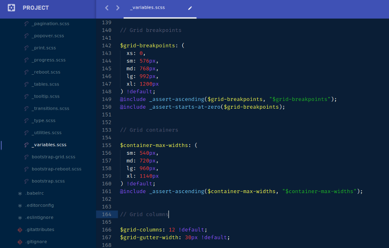
Bootstrap uses a powerful mobile-first flexbox based grid system which helps them build layouts of all shapes and sizes and this is all happening because of their twelve column grid system. This 12 column grid system creates sensible breakpoints for their layouts and interfaces and you can combine them with flexbox alignment utilities which makes responsive layouts easy. Auto-layout columns are also supported. There is also a special class .no-gutters which helps you remove the gutters between columns in their predefined grid classes and thus lets you create an edge-to-edge design.
Using their built-in grid sass variables and maps, you can also customise the number of grid tiers using $grid-breakpoints and $container-max-widths variables respectively. The number of grid columns can also be modified by Sass variables.
Foundation 6: XY Grid & Flexbox Utilities
Disclaimer: This section is bigger than the bootstrap section, just because XY Grid has lots of extra features compared to bootstrap. Please note that I am not being biased. If you want to suggest an update to the bootstrap section, with some more code, demo’s or images… just let me know in the comments section below. I will happily update.
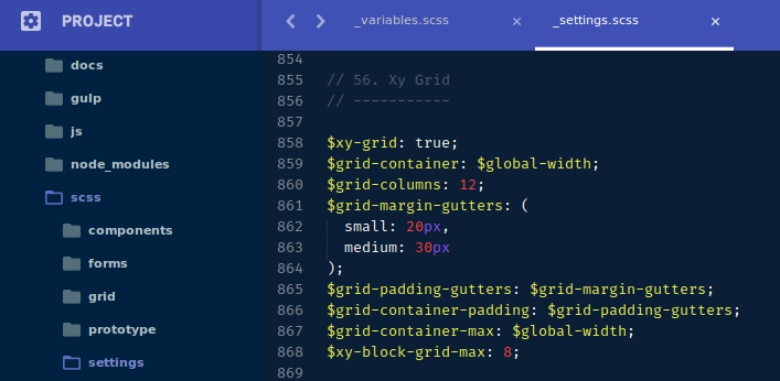
Amazingly, this is an invention actually considering that this is the first web framework supporting all these features. XY Grid is a fully reworked new grid system in v6.4+ which has lots of options including multiple grid types that includes margin grid, padding grid, frame grid, block grid and vertical grid. Here X is the Horizontal direction whereas Y is the Vertical direction. It also supports auto sizing. Believe it or not, XY Grid is a huge advancement in Grids. The things that differentiate XY Grid from others a list apart is that it supports both types of grid gutters, margin and padding respectively. Confused? Why two grid types instead of one. Well I am attaching some images to help you understand the differences between a Margin and Padding Grid.
|  |
| *Margin: No | Padding: No* |
|  |
| *Margin: Yes | Padding: N* |
|  |
| *Margin: No | Padding: Yes* |
|  |
| *Margin: Yes | Padding: Yes* |
I hope by now, you understand why having such a flexible and multi grid gutter based system is great for defining layouts. But hey, that’s not all. XY Grid has been inspired from upcoming CSS Grid and thus supports both Vertical and Horizontal Based Grid Systems. Isn’t that cool?
Flexbox Utilities: Flexbox helps you use horizontal and vertical alignment painlessly, through the flexbox based CSS properties like [align-items](//devdoks.github.io/), [align-self](//devdoks.github.io/), and [justify-content](//devdoks.github.io/). Foundation includes a handful of classes for these properties, which will work on any flexbox-enabled component.
Grid customisation is easy in Foundation. You can also build grids semantically with a powerful set of sass mixins, which you can then use in your own code to build a semantic grid. You can change the maximum width of a grid container via $grid-container. The number of columns used in the grid can be changed by $grid-columns variable, whereas responsive breakpoints can be easily changed with $breakpoints, $print-breakpoint, and $breakpoint-classes respectively.
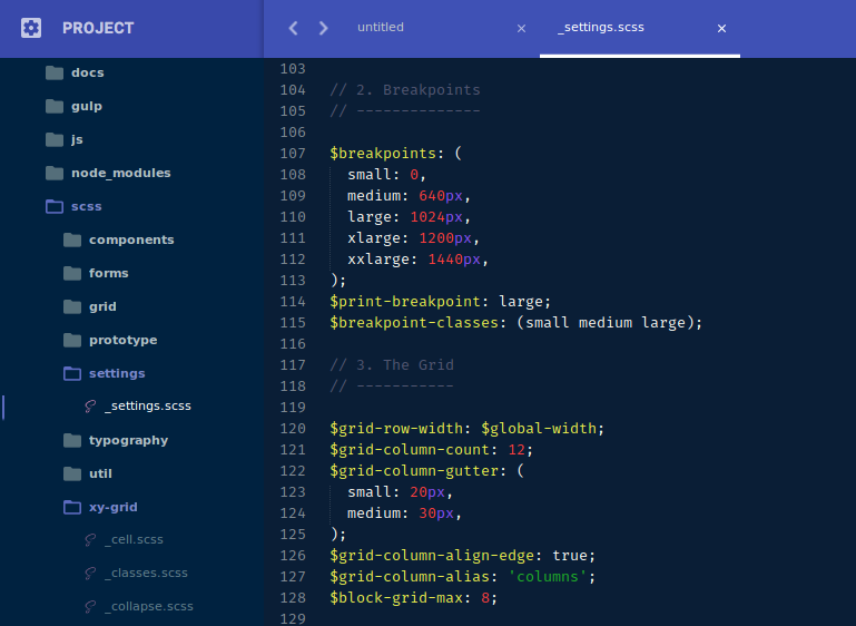
Responsive Gutters: The grid gutter aka the space between two columns within the flow of the page (X or Y direction) and the space between the edge of the grid and the edge of the page is responsive. By default, responsive gutters helps the page to have narrow edges in mobile devices whereas it becomes wider on larger screens. This can be easily customised though with $grid-margin-gutters and $grid-padding-gutters respectively.
Frame Grid: But that’s not all, Frame Grid in XY Grid incorporates the grid frame exclusively from Foundation for Apps for App Style Layouts. Well when you lay things out horizontally, the browser defaults to 100% of available width, its common no? Obviously! But it’s not the case when you are laying things out vertically, In this case what you need is to specify a height for the grid and there are couple of extremely common cases for heights, and in fact foundation has included a helper class for exactly this case, .grid-frame. The first common case is for an outer grid, typically your application layout is where you want to take up exactly the height of the viewport aka the browser window. This is exactly what .grid-frame does when applied to a vertical grid outside of any other grid. The other common case is when you are nesting a vertical grid inside of a cell in an existing grid — in this case, you would typically want the vertical grid to take up 100% of the cell, so that the Grid Frame inside of a .cell sets the height of the grid to exactly 100% of the available height.
There is one more frame grid utility that you should know about — the .cell-block classes. When you’re creating an application style layout with fixed height, you still need to handle overflowing content somehow and .cell-block lets you delegate the scrolling of the cells within your grid, and thus you are able to create an independently scrolling blocks of content within your layout. That being said, you probably don’t want that on mobile, instead you would like to have such functionality that in mobile view - the content just doesn’t scroll, and instead that content should take up the full height it needs (the normal browser state) and frame grid makes it super easy. Instead of using .grid-frame, you just need to replace it with .medium-grid-frame and it will stack on mobile.
Extra: CSS Grid
Just heard the news that CSS Grid will be shiped (in a customer release) in Microsoft Edge so this article can’t be closed without talking about the future of the web! So I would like to give a short intro to the amazing capabilities of CSS Grid. CSS Grid Layout is without a doubt, the most powerful layout system available in CSS. It is a 2-dimensional grid system, that means that it can handle both direction simultaneously, unlike flexbox which is largely a 1-dimensional system. In layman’s terms, Flexbox can only produce grid-x and grid-y whereas CSS Grid can also produce grid-xy independently from grid-x and grid-y. Isn’t that awesome? If in case you are still in doubt, here is a small example of the fun things we can do with CSS Grids. Just have a look once at grid-template-areas block in the CSS section.
Response to “Part 1 - Bootstrap 4 vs Zurb Foundation 6.4 - The Grid”