
Ever since Apple launched a retina display on the iPhone 4, web designers have been looking for a way to handle high density displays. That is where srcset and its display density descriptors come in.
The reason why we want to use srcset is because it gives the browser choice. When we use the media attribute provided by the <picture> element, we’re dictating to the browser what image it must use. That makes sense for art direction.
But when it comes to resolution switching, the browser knows best what image will work. It can make decisions based on factors that we’re not privy to such as network conditions or user preference.
So unless we are doing art direction, we should strive to give the browser options and let it make smart decisions.
Display density
The syntax for display density is fairly straight forward:
The srcset attribute is added to an <img> element. The value of srcset contains a comma-separated list. Each item in the list contains the path to an image and the density of that image provided as a multiple (e.g., 1x, 2x, 3x…).
<img src="cat.jpg" alt="cat" srcset="cat.jpg, cat-2X.jpg 2x">
The display density values—the 1x, 2x, etc.—are referred to as display density descriptors. If a display density descriptor isn’t provided, it is assumed to be 1x.
Now you have multiple densities at multiple image breakpoints. And sometimes you’re repeating your image sources because 2x at a small size could be the same as 1x resolution at a larger image breakpoint.
It gets messy quickly.
Display density descriptors are best for fixed width images
The moment you move beyond providing alternate densities of a fixed width img element, the display density descriptor becomes unwieldy and inadequate to the task.
display density descriptors and concluded that they are great for fixed width images, but are insufficient for flexible images.
Flexible images is where srcset’s width descriptors shine.
Width descriptors
The syntax for width descriptors is similar to that of display density descriptors. The value of the srcset attribute is a comma-separated list of image sources and descriptors.
The difference is that instead of having 1x, 2x, and other values representing the density, we now list the width of the image source such as 320w, 480w, etc.
<img src="cat.jpg" alt="cat" srcset="cat-160.jpg 160w, cat-320.jpg 320w, cat-640.jpg 640w, cat-1280.jpg 1280w">
The width of the image source can cause some confusion. Width descriptors are looking for the resolution of the source file.
In other words, if you open the image in an image editor, what does it say the resolution is? Grab the width and put it in the srcset attribute.
The browser picks the best source?
When you use width descriptors, you’re providing the browser with a list of images and their true widths so that it can select the best source. How does the browser do that?
Your first instinct is probably to say that the browser looks at the size of the element in the page and compares it to the list of source sizes. That makes sense, but it isn’t how the selection work.
See, when a browser starts downloading images, it often doesn’t know the size of the image in the page.
Browser pre-loader and speculative asset downloading
If you look at a timeline of how a browser renders a page, you’ll notice something striking.
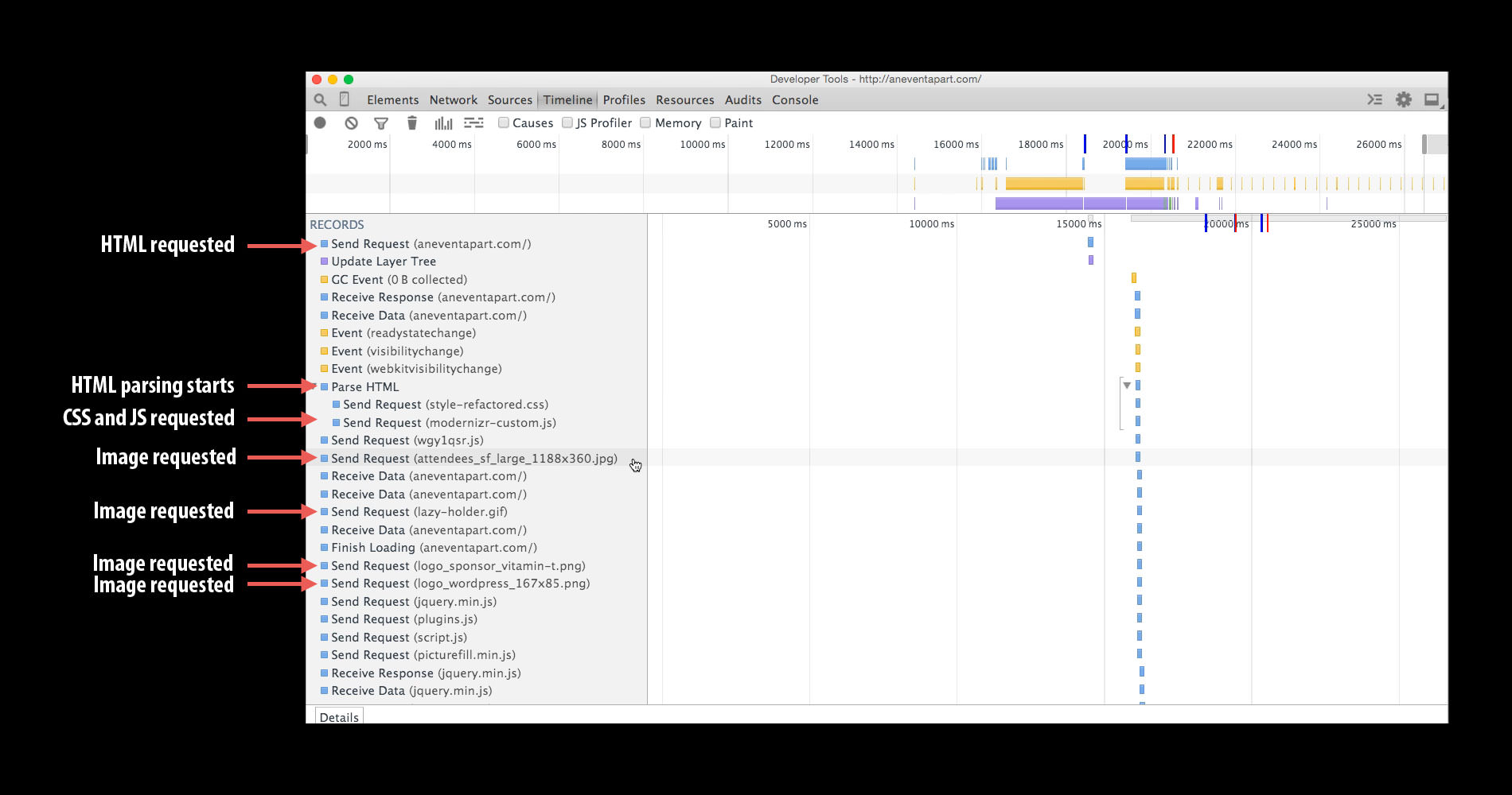
Shortly after the browser downloads the HTML, it requests CSS and JavaScript. But before the CSS and JavaScript is done loading, the browser starts downloading images.
Because neither the CSS nor JavaScript is complete, the browser is downloading images without knowing what the layout of the page will be. And without knowing the layout, it doesn’t know what size the image element will be.
BTW, this pre-loading behavior is why we can’t solve inline responsive images using CSS or JavaScript. They aren’t available when the browser starts downloading.
The only thing that the browser does know is the size of the viewport. Once we move past display density descriptors, everything hinges on the size of the viewport.
Response to “Responsive Images With Srcset Display”