
Debugging HTML and CSS problems can really ruin your creative momentum, but they’re inevitable when building almost any web project. It’s annoying when you’re designing a page and suddenly you notice that something isn’t quite aligned right or colored correctly.
If you know how to face rendering problems directly and solve them quickly, building websites becomes much more enjoyable. Every issue you encounter will be unique in its own way, but most can be resolved by adhering to a few basic “sanity checks” that can help you work with your code, rather than fight it.
The steps outlined below are in no particular order. Debugging is part technical and part intuitive art form that’s only learned with practice. As you build more projects, the debugging methods that you should try in different situations will become more obvious.
Check for syntax errors
Even though these are in no particular order, my debugging instincts usually jump to syntax first. I ask myself, “Did I miss a semicolon? Did I forget to close an HTML element?” No matter how experienced you become, you’ll still make typos and mistakes. Often times you can simply switch back to your text editor, look at the last thing you wrote, and fix the problem.
However, if you’re working in a large project, it might be helpful to use a validation tool. The W3C markup validation service and the W3C CSS validator are perfect for this, because any warnings or errors will reveal places to check your code. Sometimes these results can be difficult to read, though, because these validators aren’t specifically designed for detailed debugging. An alternative is to use a linting tool like CSS Lint, which can perform an analysis of your code and help you find errors.
Prevent cross-browser issues
Most display problems in HTML and CSS come from cross-browser issues. The site looks fine in one browser, but there’s problems in another. This is almost always a problem on any web project, but you can minimize the number of cross-browser issues by preventing many of them from happening in the first place.
First, always make sure that you’re using a good CSS reset, such as normalize. This will “level out” inconsistencies between browsers and make them behave in a more uniform fashion. Even if you’re just doing a quick one-page site and you’re not using a CSS framework, you should still use a reset.
Second, check to make sure that the HTML elements and CSS properties that you’re using are indeed supported. HTML and CSS are always evolving, and browser vendors do the best they can to keep up with the latest standards. If you’re not sure about the support for a particular element or property, look it up on caniuse.com for a detailed breakdown.
Outline elements with Web Developer
When debugging, it can be helpful to outline elements on the page to figure out how they’re being rendered in relation to one another. You could write CSS to do this yourself, but a better way is to use the Web Developer browser extension available for Chrome, Firefox, and Opera.

The Web Developer extension allows you to outline elements based on different criteria, such as display type or element type. At first glance this might seem trivial, but in a convoluted web of cascading declarations, it can be easy to lose track of which element ultimately ended up with which properties and values. This is helpful for catching rogue floats or mixed display types. And speaking of display types…
Check display types
Every element on a web page has a display type, such as inline, block, inline-block, table, flex, none, and many more. Check out the MDN docs display page for a full list (even if you think you know them all, you might be surprised).
CSS works best when you build within the standards outlined by the W3C. However, with so many combinations, it’s impossible to know exactly how any particular browser might handle different elements with mixed display modes. Mixing display types is perfectly normal and isn’t inherently bad, it’s just something to be aware of when debugging. If you see an opportunity to match the display type of sibling elements, try it out to see if it fixes the problem.
Turn off styles with the Chrome DevTools
If you’re wondering how your CSS is affecting a particular page element, the Chrome DevTools make it easy to toggle each property. In the Google Chrome web browser, simply right click and choose Inspect Element from the context menu. This will bring up the Chrome DevTools.
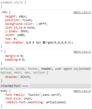
On the right side of the Elements panel, you should see a tab called Styles with some CSS inside of it. This shows you which CSS declarations are being applied to the selected element, and if you hover over each CSS property, you can uncheck them individually. When a property is crossed out, it typically means that it is being overridden elsewhere. You may need to uncheck a property in several places to actually remove it from an element.
This might seem a bit tedious at first, but it’s actually one of the fastest methods for spotting style errors that are inconsistent with the CSS you’ve written (or at least the CSS you think you’ve written). This is useful for deciding whether or not a particular CSS property is a problem and whether or not the CSS you wrote is actually being applied (which could be an issue with selector specificity). And then, if your CSS is being applied, you can also figure out if it’s producing an effect at all.
Use the “computed” tab in the Chrome DevTools
In the Elements panel of the Chrome DevTools, right next to the Styles tab you’ll find another tab called Computed. I find myself spending a lot of time in this tab because it tells you exactly how the browser is computing your styles. When working on large projects this is essential for resolving cascading issues, problems with selector specificity, and more.
At the top of the Computed tab there’s a very important diagram that every web professional should make use of. This is a representation of the box model and it shows you how much space an element occupies in pixels.
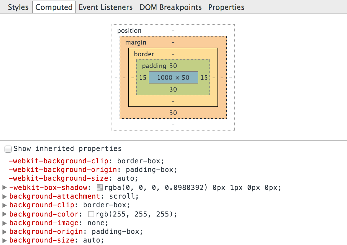
More specifically, it breaks down an element’s space into content, padding, margin, and border. When elements aren’t spaced quite right, this can be incredibly helpful because you can literally “do the math” and figure out which element is a problem. For example, if you have three floated elements that should all be on the same line, and the last element is instead jumping down to the next line, you can inspect the width of the parent container and then compare its value to the widths of the three elements.
Response to “Tips for Debugging HTML & CSS”