
Thousands of people may be visiting your site every day, but if you don’t convince them that they should be using your product, subscribing to your service, or registering in some way, then your web app’s homepage is simply not doing its job.
Successful web apps use similar formats when it comes to user interaction on their homepage. For instance, most feature an explanatory strapline that tells you what the service does, many show you screenshots of their service, and they all entice you to sign up or register with a prominently placed button. But is it really that simple?
If you design a site with this simple checklist of ‘must-haves’ in hand, is the resulting site guaranteed to turn your visitors into users? What are the elements of a home page that make it really effective at transforming visitors into users? And how does the design itself contribute to this?
Most designers agree that not only do you have to have brilliant navigation, impeccably-crafted copy and a great sales message, but you also have to have that something extra in the design that will speak volumes to your potential users.
We invited some leading designers to look at a selection of high-profile apps to examine how they’re attempting to turn visitors into users through user experience design.
Building Trust is key
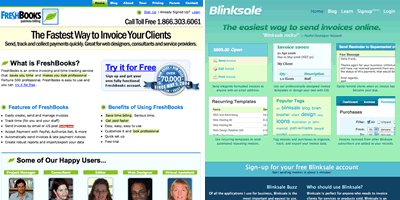
First up, Blinksale and Freshbooks, which both offer services that will help the small online business get bills out quicker or easier. Blinksale’s strapline is ‘The easiest way to send invoices online’, whilst Freshbooks is ‘The fastest way to invoice your clients’ – essentially they are competing for the same users.
View of their older version websites.
Blinksale
Pros
Blinksale’s home page clearly and attractively outlines the benefits of the application and makes me really want to get started.
Cons
Not 100 per cent obvious how I get started. The big “Sign-up for your free Blinksale account” was below the fold (for me at least) and did not look like a link.
Freshbooks
Pros
FreshBooks is the exact opposite of Blinksale. Their home page is not as good at getting me to want to sign up.
Cons
It seems that there’s too much to read and too many different types of content on the page. The promotional claim centers around ‘fast,’ but the content is a bit pedantic.
Turning visitors into users your homepage needs to make them feel the way they will feel when they use your service – happy, satisfied, excited. And this kind of trust begins with how the information is presented on your site:
The Shop Window Approach
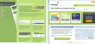
In the web metrics space we looked at Mint and the recently launched CrazyEgg. What’s immediately noticeable is that both sites think its important to let their clients know how the application works by prominently featuring screen shots of their application in action on the home page.
Using big design statements to direct your users to a call for action is key for converting visitors to users.
When The Homepage Doesn’t Matter
In these days of RSS and APIs, where content is often viewed separately from its source, how important is the design of your homepage? Will your users even make it there? Or will they slip in the backdoor through a followed link?
Homepages don’t matter – at least when your content does the job of turning visitors into users for you as it does on sites such as YouTube.com.
I don’t visit YouTube and click around. But I see blog posts with cool videos all the time. I don’t think of YouTube as a site. What draws me in is a blog post, IM or email. Then, when you end up watching a video on YouTube’s site, you realize there are more cool videos there, and might start clicking around. In this way the root of each visit is a permalink, a particular video, a certain experience – not the home page. The video is the epicenter of the permalink, and the permalink is the epicenter of the whole site. Everything revolves around the videos you love, not the farm that feeds them.
Based on this view, the home page is secondary to the permalinks. The home page should show me permalinks I’ve recently visited, recommendations based on those, and so forth. It should provide history and continuity of experience.
So remember – if a big part of your success is going to depend on links, RSS feeds or blogs, you need to make every single page on your site just as effective at generating those all important new sign-ups: getting the positioning, colour, language, shape and prominence of every element on your homepage right is just the beginning.
Response to “Turning Visitors into Users”