
At the core of typography is the critical task of setting type in grids. A grid brings order and hierarchy to a page—it lives at the center of any piece of design. It can influence every aspect of the design, like image ratios, measure, order of information, and the remainder of the layout.
Grids are an essential part of a designer’s arsenal, creating a neatly-crafted, equal system for arranging content in the space of a screen. But they aren’t rigid—grids can change depending on the content around them.
Related: The big list of free typography resources
In this eBook (which is totally free—get the entire course here), I’m going to talk about creating grids for screens.
Multi-column grids
A multi-column grid focuses on splitting the page into more than one vertical column, with a gutter. Traditionally for the screen, this has manifested itself in a 12-column grid, often set at 960px wide with 60px columns and 20px gutters.
The numbers 960, 60, and 20 may seem arbitrary, but there’s a good logic behind them: 960 is a versatile grid that is divisible by many different numbers (16, 12, 10, 8, 6, 4, and 2). This versatility makes it possible for a designer to use many varying widths within the grid to make a design feel both interesting and uniform.
Anatomy of a grid
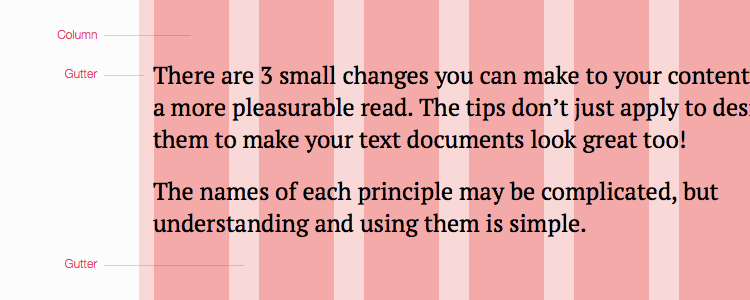
A grid is made up of 2 parts: the column and the gutter.
- A column of a grid is the widest part
- A gutter is the space between each column
Gutters are technically made up of 2 margins. An example: With a 30px gutter, there are 15 pixels on either side of the entire grid from the outer columns.
To baseline or not?
Maintaining a baseline when designing for the screen is next to impossible. It requires total control over the content to a degree that isn’t maintainable for most user interfaces or websites. With this in mind, I usually focus more on ensuring a consistent vertical rhythm rather than being strict about a baseline grid.
If baselines are easy to maintain in print, why are they difficult to maintain for the screen? Because print is static and user interfaces are dynamic. It’s too difficult to enforce content guidelines or to estimate the sizes of media and content that people will add to a page. Even services like Instagram would struggle to maintain a baseline grid.
In short, focus on maintaining a clear, consistent vertical rhythm on a page and you’ll achieve a similar, just as elegant effect.
Creating a grid
Your grid for the screen should consider a number of things:
- The measure of the body text (How many columns will it span?)
- The size of the viewport you’re designing for and the flexibility of that grid
- The horizontal and vertical rhythms (the gutters and margins)
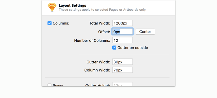
A combination of these 3 allows you to come up with an idea grid. When designing for the web, I typically create a grid that’s around 1200px wide with 30px gutters, as this suits the size of type I tend to use for the screen and the kind of whitespace necessary for a project—plus, it looks great on the monitors we use today.
So, figure out what the answer is to these requirements, and figure out a grid that’s right for you. Applications like Photoshop and Sketch have tools that let you create a grid and start practicing, so jump into these to find a perfect width for your project. Always pick a grid that can break down into different sizes, or one that will have flexibility to scale up or down in size.
When you’re using a grid, see it as a useful guide on how to lay out, reorganize, and set content into the page. Grids save you time.
Reducing the grid to a smaller size
With responsive design, the size of the grid must increase and decrease. The values of the grid should always be a little flexible (e.g. percentages and max widths), but when the layout starts to break, know when to reduce the number of columns in the grid to suit the screen device.
To do this, simply resize the page to a point where it’ll break in its flexibility, and reduce the number of columns. The reduction of columns is an aspect some designers forget about and instead they reduce the widths of each column. Realistically, a 12-column grid on a 320px screen isn’t going to help anyone. So reduce it down to 2 or 4 columns so that sufficient gutters are available.
Putting text in the grid
Once you set up the grid, start setting type in the grid and placing content inside it. All text doesn’t have to be set flush left—it can be set in equal columns or anywhere on the page. Consider what you’ve learned in this e-course and use your new skills to create an elegant layout with type.
Grids are versatile
Don’t ignore the versatility of the grid. Just because the edge of a column is there doesn’t mean images have to totally span all of the columns. Consider the Gestalt Principle of Proximity when designing within it.
For example, imagine you have a block of text, and to the right of it you have a sidebar that contains some links. If the text block went all the way up to the edge of the sidebar, those 2 blocks would feel related. As designers, we need to communicate to users that these 2 types of content aren’t necessarily related. An easy way to do this is to move them further apart! This breaks the grid a little, but it improves the experience.
Breaking the grid is a great way to draw the reader’s eye to content or to a promotional area. When I’m designing a hero area, for example, I try to do something that disrupts the grid. This prevents that area from blending into the flow of the page, making the user more likely to engage with that area.
Final thoughts
Typography has a massive impact on how a design is perceived. Make sure it’s one of the highest priorities on a project, and spend plenty of time choosing the right font and setting it correctly to bring visual harmony to a page.
Response to “Typography And Creating Grids For Screens”