
There are 3 small changes you can make to your content to provide a more pleasurable read. The tips don’t just apply to design—use them to make your text documents look great, too.
The names of each principle may be complicated, but understanding and using them is simple.

Important note: every font is different, so if the content doesn’t feel right, go ahead and adjust your measurements. What’s important here is that the reader is getting a comfortable reading experience and that it looks correct to your eye.
Use typographic hierarchy to give a clear sense of the structure of a page
Typographic hierarchy is the visual hierarchy of the text on a page.
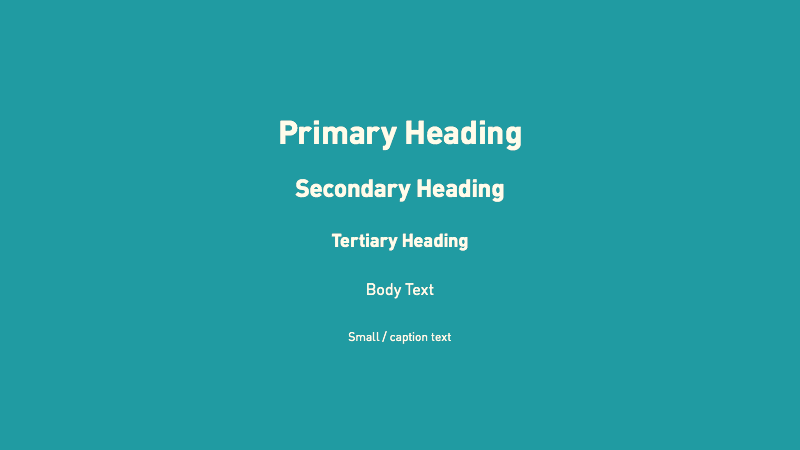
Imagine a textbook. In it, the primary heading (the chapter title) is more prominent than the secondary heading (the sub-heading) which is, in turn, more prominent than the body text (the main content of the page). The same principles should be taken into account in a design or Word document.
“Use typographic hierarchy to give a clear sense of the structure of a page.”
All font sizes should be derived from the body text, as this is what will be most-read on each page. Here are a few simple steps to define your hierarchy.
- Body text: increase or decrease the text size until it’s comfortable to read. For this article, let’s set it at 22pt.
- Primary heading: 180–200% of the body text, between 40–44pt
- Secondary heading: 130–150% of the body text, between 29–33pt
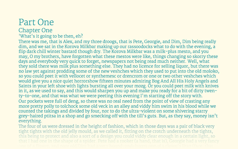
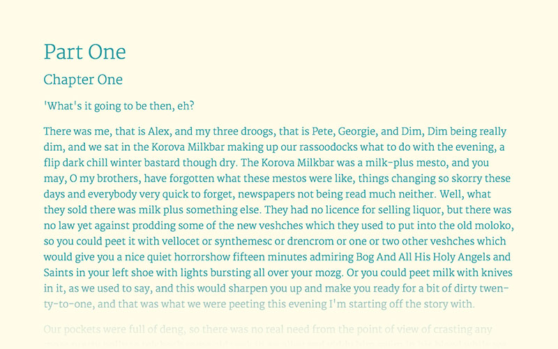
Here’s what the page looks like after following this advice:
Further considerations
These levels weren’t necessary for this article, but you should also consider a tertiary heading and caption text.
- Tertiary heading: 100–125% of the body text, between 22–28pt
- Small text / captions: 70–75% of the body text, between 15–17pt
Use vertical spacing to make your words easier to scan
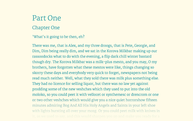
This is the spacing and arrangement of text as the reader descends the page. We need to make sure the the line spacing and space between paragraphs is generous enough to allow the eye and brain to more easily decipher characters, words, and word shapes—which is how we all read.
“Use vertical spacing to make your words easier to scan.”
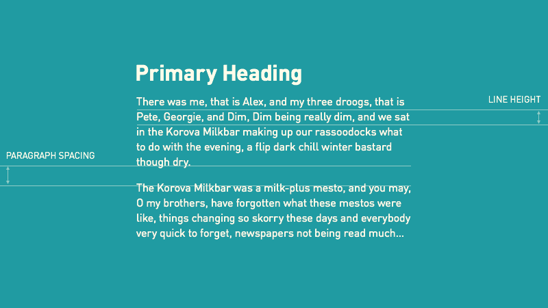
Paragraph spacing
Setting the paragraph spacing is simple, but it’s very different than just pressing “return” twice for a new paragraph. Pressing return twice means the gap is too big to immediately decipher whether it’s part of the same or a new section of content.
In most cases, it should be equal to the body text, so if the body text is 16pt then the paragraph spacing is 16pt.
- In design applications and CSS this is the equivalent of setting margin-bottom of paragraphs to 16px or 1em
- In a Pages/Word document, set the “After paragraph” value to the size of your body text
Line spacing
The line spacing should be set somewhere between 120–160% of the text size. As a rule, the smaller the text, the more generous the line spacing needs to be to give each word room to breathe.
Pro Tip: You should be able to fit a sideways “h” between the lines without it hitting the tops of d/b/t’s (ascenders) or the bottoms of p/q/y’s (descenders).
If the body text is 22pt, then the line-height of that text should be between 26–35pt.
- In CSS, you can set this using ems or unitless values (e.g. 1.2), but it may require adjustment to make it feel right
- In a Pages/Word document, the line height will be set in decimals, with 1.2 being equal to 120% of the text being edited
Adjust the measure to make each line of text more comfortable to read
The measure is the length of a line of text. Long lines of text are difficult to read, with shorter lines being easier. The ideal number of characters per line is 65–75. The measure should be defined by the width of the body text rather than headings or sub-headings.
“Set type as part of your content creation workflow, and your readers will be in for a treat.”
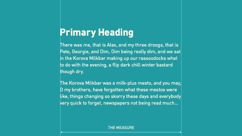
Pro Tip: A line of upper- and lower-case letters and numbers is 62 characters, a simple way of finding a comfortable measure.
When you’ve worked out where 65–75 characters is on a line, reduce the width of the column of text until that is about to wrap, you should find the measure is comfortable.
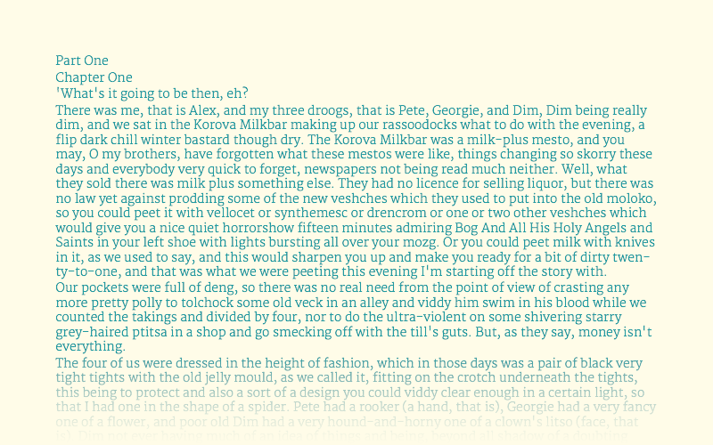
The final result
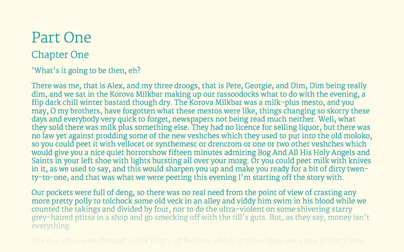
Once you’ve followed these steps, the readability of your content should have vastly improved, as seen below.
Setting type is not an inaccessible skill—it’s possible to follow a few simple principles to make every bit of content an easy read. Make this part of your content creation workflow and your readers will be in for a treat.
Response to “Typography Tips For A More Comfortable Read”