
Working with flexbox layout can be tricky, especially in React Native. But there is nothing to scare. It’s easy to understand, just take a closer look not just on how it works but on why it works this way.

Flexbox layout concept
In a generalized sense, the main concept of flexbox layout — creating parent element adding to it
.container {
  display: flex;
}
and nesting child elements in it, which ones we want to position. After this actions, parent container became Flex container element, and child elements automatically became Flex items.
Let’s leave aside Flex items and take a closer look at Flex container.
By default Flex container aligns all children elements horizontally, because of CSS flex-direction property with initial value ‘row’. Also, flex-direction property establishes the direction of the Main Axis in Flex container.
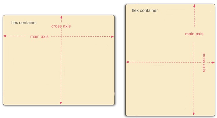
Left image {flex-direction: row}, Right image {flex-direction: column}
Left image {flex-direction: row}, Right image {flex-direction: column} This means that Flex container children always follows parent container Main Axis direction and by changing flex-direction property we are changing Main Axis direction and ipso facto changing child elements alignment direction.
React Native layout differences
React Native uses limited Flexbox layout properties and values. But it’s fairly enough to meet all your requirements.
First and the main difference I should start with — is that all container elements in React Native are Flex containers by default. There is no need writing extra code or adding different properties, just take it and use it.
But remember one rule: If the element has a parent container, child element can be positioned with Flex item property — ‘align-self’ inside parent container still being Flex container, behaving and accepting Flex container properties.
Here is the example (all purple squares are nested in Flex container parent):
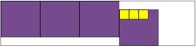
Applying ‘align-self: flex-end’ property to Flex container (last purple box) which contains another elements.
The second one difference is how do we use property flex.
Flex property will define for Flex container how it should manage space along the Main Axis or how it should share space among several Flex containers.
So if we will skip this declaration, container will just expand to its content width and will stop where it is, but if we will set:
flex: 1;
the container will expand full available width along Main Axis of its parent.
Hint: to prevent expanding full width after declaring flex: 1, use maxWidth/maxHeight property.
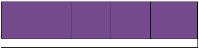
Some examples (parent has vertical Main Axis):

Left image {flex: 1}, Right image — no flex declaration
As I mentioned before, flex property with different numeric values could be used for specifying grow factor for Flex containers, and actually replaces ‘flex-grow’ property. For example, here I set:
first: {
  flex: 3
},
last: {
  flex: 2
}
for this the following elements (all purple squares are nested in Flex container parent):
First: {flex: 3}, Last: {flex: 2}
And in conclusion, I want to add some GIF’s I made to show how align-itemsand justify-content property works:
Justify-content property will always align content along Main Axis. Here you can see animated property justify-content with following values: flex-start, flex-end, center, space-around, space-between; (all purple squares are nested in Flex container parent):

Justify-content: flex-start, flex-end, center, space-around, space-between
Align-items property will always align content along Cross Axis. Here you can see animated property align-items with following values: flex-start, flex-end, center; (all purple squares are nested in Flex container parent):
Align-items: flex-start, flex-end, center;
Conclusion
Flexboxes are easy to understand and pleasurable to maintain. The facebook team made them as comfortable as it possible, cutting off all unnecessaries that we can focus on productive development and step into a bright future.
Response to “Understanding React Native flexbox layout”